
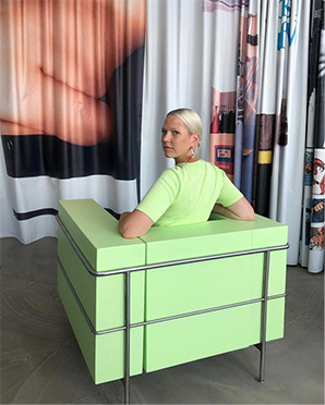
Spoiler alert: it includes lime green. You may not have heard of Chartreuse, but we bet you’ve heard of and own an item in lime green. A bold color, between yellow and green, and verging on neon, it’s been very popular the past few seasons. But did you know that lime green is actually a shade of chartreuse?
Today we want to dive in a bit more into one of our favorite colors. Chartreuse is often called by one of its shades: apple green, lime green, light grass green, light green with a tinge of yellow and mellow yellow.
It is a mix of warm and cool colors The greener shades of chartreuse have a fresh, springtime feel, and can be a bit '60s retro. Its name comes from the similarity to the color of a French liqueur, Chartreuse. There are two different varieties of Chartreuse liqueur: yellow and green. Both are made from herbs and plants which are steeped in alcohol.

According to Nix Color Sensor, just as there are many shades of chartreuse (from lighter to darker, desaturated to neon, greener to yellower), the hue can run the gamut of emotions. On one hand, it can evoke feelings such as joy, vibrance, cheerfulness, enthusiasm, happiness, nature, growth, spring. On the other hand, it can be associated with sickness, jealousy, and cowardice.


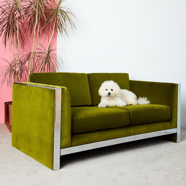
Chartreuse is often used as a substitute for yellow. That’s why we love pairing it with purple tones such as lilac, or bubblegum pink. It communicates boldness, youth, vitality, and creativity. Unlike mid-range green and its connection to nature, chartreuse is less restful because it is more aggressive and bold. In the past, chartreuse was considered as a “fake color” - it had a bad reputation. For example, it was scarcely used in Fashion. For decades, people stayed away from it. And when it made a resurgence, appearing on the covers of Vogue and Seventeen, journalist Patricia Leigh Brown commented "It's truly unfortunate that somebody is trying to promote chartreuse." And she wasn’t the only one. Noted makeup expert, Pablo Manzoni, exclaimed that "Chartreuse is a miserable color. Nobody looks good in it. Because of the high condensation of green and yellow, it is lethal, I repeat, lethal. The teeth look yellow. This is just a deadly thing."
Thankfully, 30 years later, the color made a comeback. It’s become more popular than ever.
In a recent Pantone Color Institute word-association studies, they see that people now associate these happy yellow-greens as reviving, youthful, artsy, and bold. Colors that make an impactful statement about who you are, "It is a somewhat polarizing hue, and women are so ready for that!"
We think the lime green which is a less yellow, less saturated shade of Chartreuse, is more refreshing and youthful. So how to incorporate Chartreuse and its shades in your designs? If you intend to make it the base of your design, use the less yellow shade. But if you’re planning to use Chartreuse as an accent color, prefer the more yellow, olive-toned shades. They will work very well.
What shade of Chartreuse is your favorite? We might have the shade you love in our new color palette Carnival. You can check it out here.
Image credits:
First image (thumbnail): @clairexue
Second image: Photo by @comingsoonny
Third image: Lifewire / Ashley Nicole DeLeon
Fourth image: @comingsoonny and @backdrophome collaboration
Fifth image: Photo by @traceeellisross
Sixth image: Photo: @traceeeliscross
Seventh image: Chair made by @paulcournet
Eight image: Photo by @putnamflower


New Comment