Diane Villadsen is a color-obsessed commercial photographer whose work explores surreal spaces and themes. Tomato red, bold femininity, and geometric elements star in her images, which aim to reflect the intersection of design and reality. Select clients include Zappos, Allbirds, Mailchimp, Oppo, Twitter, Atelier Cologne, Wisp, Bose, and Xiaomi. Her work has been published in Aesthetica Magazine, Content Magazine, Ignant, Frankie Magazine, and Fstoppers.
New
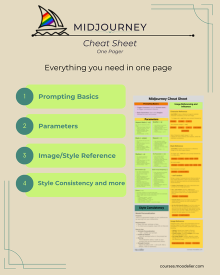
Midjounery Cheat Sheet
$71

40% off
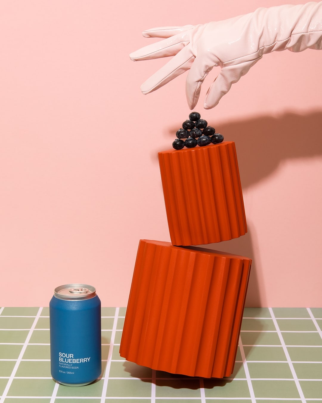
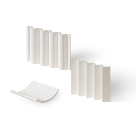
Bumpy bundle
$139
$231

40% off
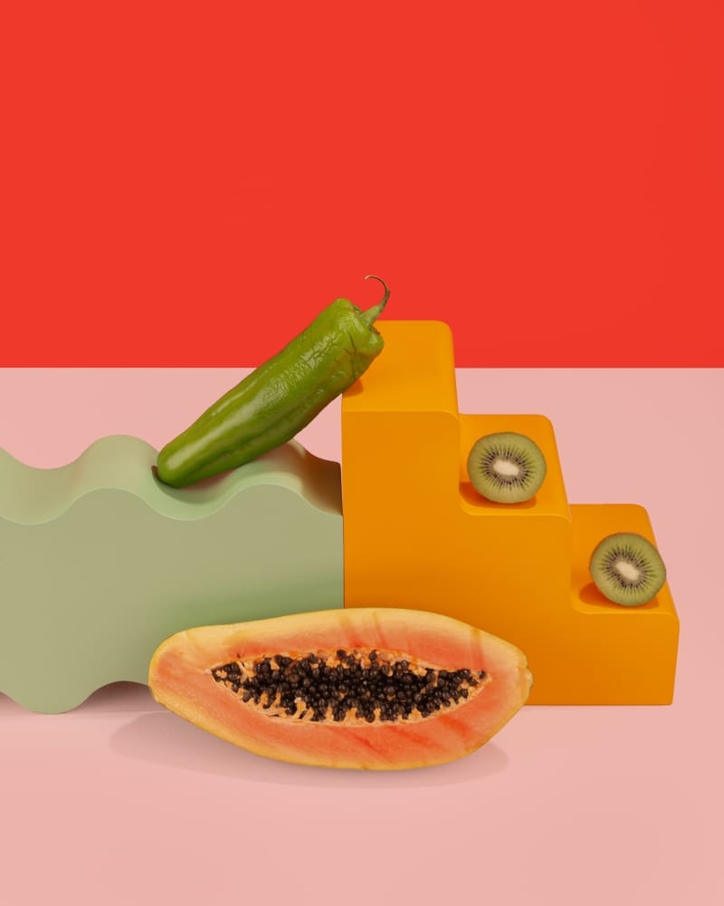
Curvy step
$117
$195
40% off
The Teensy Bundle (3-piece)
$99
$164
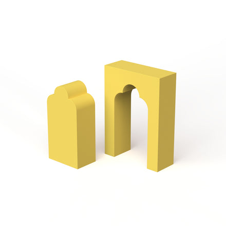
40% off