When it comes to creating a sales page that converts, there are two ways to stun your audience: You can (and should) have beautiful visuals. The information you share, and the way you lay it out, should draw your reader in and make them feel compelled to buy. To us, a stunning sales page is the perfect mixture of aesthetically pleasing visual content + conversion-oriented copy.

" it’s important to remember to never sacrifice strategy for aesthetics. "
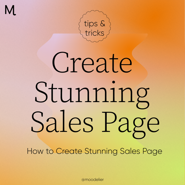
You might recall that we shared our live launch strategy with you - so the next and most natural step would be to chat about your sales page. Whether you’re launching a digital or physical product now or a year from now, one thing is certain: everyone needs a stunning sales page.
Your Sales Page Layout
It might be tempting to build out a sales page that is completely oriented around being pleasing to the eye. But, it’s important to remember to never sacrifice strategy for aesthetics.
When it comes to the layout of your sales page, there are a few visual indicators that should be included:
- A call to action at the top of your page, in larger text. This call to action should speak to your audience, tell them what the product is, and how it’ll help them.
- A button to add to cart, at the top of your page. Some customers will prefer to skip the copy and immediately buy - so make sure you give them an easy way to do so.
- Further down the page, make sure to discuss a problem that you’re helping your audience overcome. Will they be able to sell, create, decorate or do more? Ask yourself why this product is important, and how it’s helping others. Then, make sure to include that in your sales page.
- A countdown. Whether you choose to add this to the top of your page, the middle or the bottom, add a countdown in! The countdown can track how much time is left in your live launch, or even serve as a reminder for the date that your launch will first go live. Do what you feel works best.
- A few testimonials from your customers or your focus group if you don't have any customers yet. We talked more about what is focus group is in our live launch blog post.
Sales Page Must-Haves
Aesthetically speaking, there are a few things we believe every sales page needs to include in order to attract and hold the eye, without leading to confusion.
Our must-haves?
*Variation in text and color to add contrast to your page. Choose a good main font for the context and info about your product, and two larger headers for the rest.
*A short video (2 minutes or less) that describes the product. An extra bonus? If you can be in the video sharing your enthusiasm and excitement about the product you’re selling, that’s even better.
*FAQs and testimonials from the focus group you hosted. Preferably, you’ll want to include those near the bottom of your sales page so you don’t clutter the section where you’re actually selling the product.
*Beautifully imagery, used strategically - because overloading your sales page is just as bad as using no images at all.


" Just remember to keep things simple, strategic and stunning. "
Sales Page Skips
When it comes to your sales page, try to keep things simple, strategic and stunning. To do so, there will naturally be a few things you’ll need to skip when building out your sales page.
Our advice on what to skip?
*Using more than three calls to action. You’ll want to add a button to the top of your page, the middle of your page, and the bottom of your page. Any more than that will just feel overbearing, and any less might get confusing for your reader.
*Too-large blocks of text. As an example, if your testimonial list is lengthy (great job), break things up. You might want to include part 1 of your testimonials under the info about your offer, and part 2 under your FAQ section.
Simple, Strategic + Stunning
After launching multiple digital and physical products over the course of the last 18 months, we’ve found a surefire way to build out our sales pages, without overwhelming our audience. Just remember to keep things simple, strategic and stunning.
Oh, and your product? It speaks for itself. Trust us 😎


New Comment